
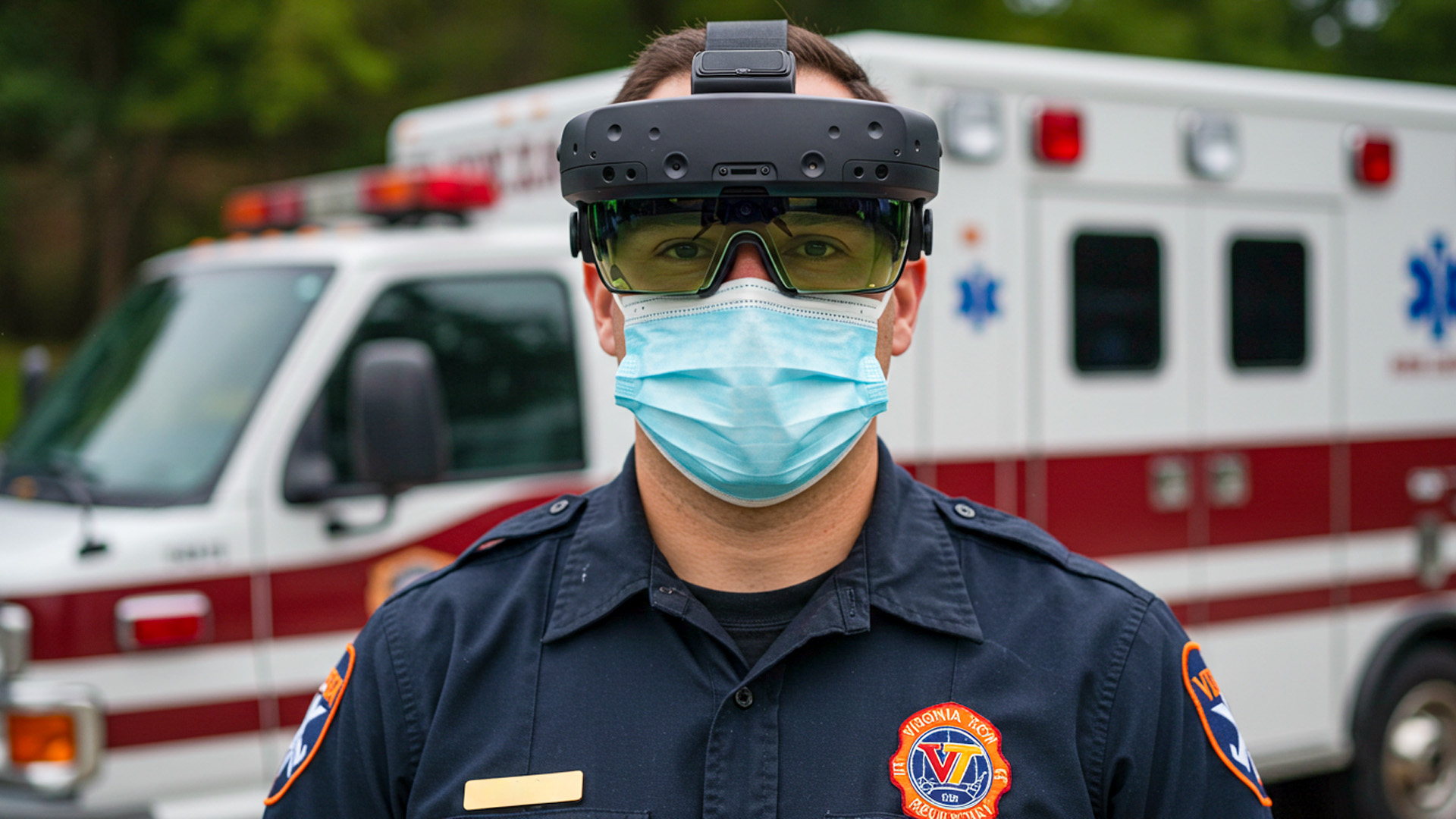
Field-Ready Augmented Reality for Public Safety Operations
A radio crackles; the crew doors slam; the world narrows to seconds. In that blur, augmented reality earns or loses its place on the rig. Today’s public safety teams experiment with see-through displays that paint hazards, routes, and roles directly onto the world. The promise is simple: compress decision time without inflating cognitive strain. Yet the path from lab prototype to soot-covered, sweat-slicked street gear is anything but simple. This article explores how overlay insights improve situational awareness, what the best user-interface patterns look like under duress, and where hard technical limits—tracking drift, network hiccups, battery thermals—collide with high-stakes reality. Think of it as a field manual written for both product engineers and incident commanders.
On-Scene Clarity: Overlaying the Invisible in Chaotic Environments
Wayfinding and Micro-Nav for the Golden Minutes
In the first ten minutes of an incident, responders juggle poor visibility, incomplete maps, and shifting perimeters. AR wayfinding can convert that chaos into directed motion. Instead of a static 2D map, responders see a breadcrumb path anchored to their egocentric view: doorways are haloed, stairwells glow, and egress routes pulse when smoke density spikes. Micro-nav—turn-scale guidance within buildings—depends on hybrid localization: inertial dead-reckoning smoothed with UWB or BLE beacons, fused into SLAM maps that survive occlusion and dynamic crowds. The UI pattern that works best is glanceable and redundant: headset arrows plus floor-level chevrons and tiny wrist prompts for cross-checks when head pose is blocked.
Consider a medic threading through a mall after-hours. The map app knows the store numbers, but AR knows where pillars steal sightlines and where escalator up-ramps outrun littered down-ramps. The overlay mutes noncritical icons so the medic’s saccades land on the only two things that matter: the next turn and an ETA to the patient’s tile. Subtly animated path segments encode confidence—solid for high localization certainty, stippled when drift increases—so crews can switch to handheld lights without feeling betrayed. There’s no “recalculating” voice to drown out radio traffic; just a quiet, steady ribbon that leaves peripheral headroom for real-world surprises.
Triage at a Glance: Vital Signs, Threats, and Priorities
Triage overlays are not a dashboard—they’re a queue. The UI surfaces the next best action using color economy and spatial anchoring. A patient silhouette follows START/JumpSTART logic with minimal chroma: muted neutrals for assessed, reserved accent for new information, and intense color only to flag airway or hemorrhage risks. When vital signs flow from wearables or quick-check devices, the overlay shows trend arrows, not raw streams, with confidence intervals that shrink as readings stabilize. The design goal is “deliberate underspecification”: give the clinician enough context to move, not statistics that tempt rabbit holes. Voice notes attach to a person’s spatial anchor, so handoffs are as simple as looking.
In a bus rollover scenario, an EMT kneels beside a conscious adolescent while the overlay quietly stacks three cues: a high-priority label (tachycardia trending), a timer since first assessment, and an icon for a nearby tourniquet kit because the closest bag ran dry. The system does not flood the view with every patient blob; it ranks by proximity and acuity, then dimly ghosts the rest. When the EMT marks a recheck, the overlay schedules a subtle, peripheral shimmer rather than a modal alert, preserving both scene awareness and calm. The effect feels more like a practiced partner tapping your shoulder than a phone demanding a swipe.
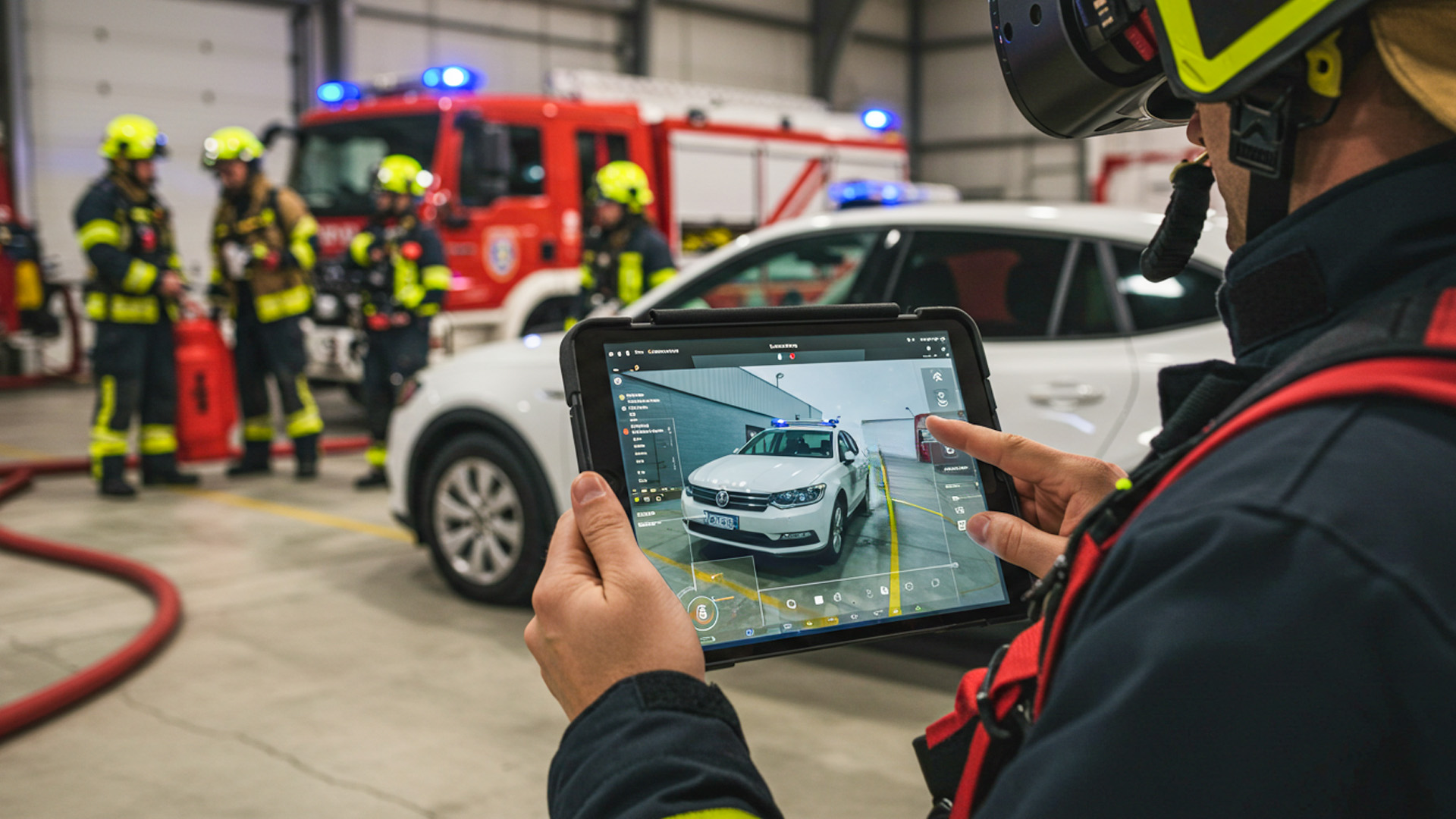
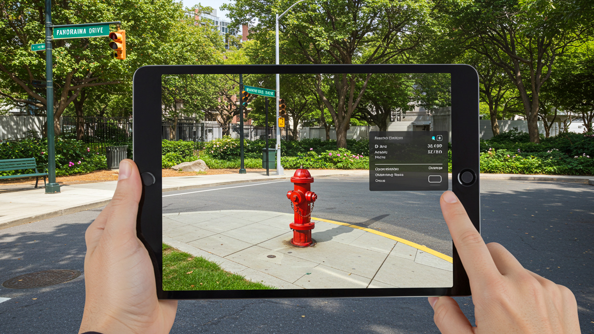
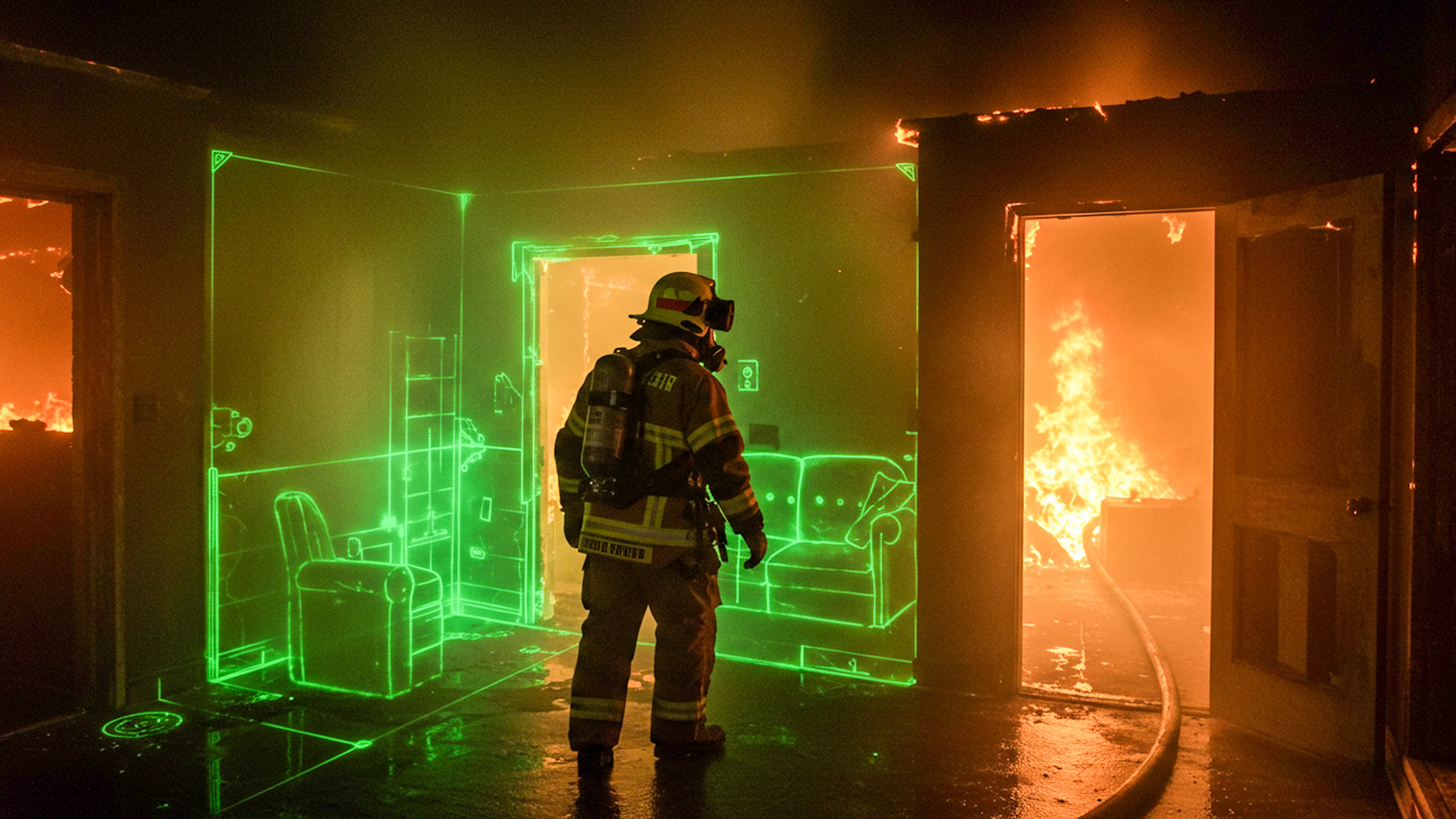
Perception Stacking: Hazard Cones, Plumes, and Power Lines
Fire, smoke, and night erase edges that responders rely on. AR “perception stacking” restores edges and adds the invisible. Thermal cues from a camera can edge-enhance doors and attic voids; gas sensors paint low-lying plumes; LIDAR hints at collapsed voids and ankle-breaking debris. The interface must respect occlusion to preserve trust: a highlighted hydrant should tuck behind a truck when you move. Hazard cones—virtual volumetric boundaries—should breathe gently, not flash, so they read as space, not signage. Labels should carry uncertainty: downed-line possible beats false certainty. All of this lives or dies on registration fidelity; jittery overlays are worse than none.
Imagine a car into a pole with wires draped across a sedan. The overlay projects an exclusion zone based on line sag and recent wind gusts, expanding as crews approach. A subtle auditory tick rises when a head turn places the hazard at the edge of vision, leveraging our ears for spatial warning without stealing the eyes. If a thermal plume indicates brake fire risk, the cone extends in the direction of slope to warn against parking a rig downhill. The UI’s restraint is intentional; in high entropy scenes, neutrality of tone and motion prevents visual fatigue while still modulating behavior in time.
Interaction Under Stress: Designing Inputs That Don’t Demand Attention
Hands Busy, Head Up: Voice, Gaze, and Minimal Gestures
High-stress environments punish fussy input. The most resilient AR stacks combine three low-friction channels: voice snippets, dwell-based gaze selection, and simple gross gestures. Voice works when phrased as short imperatives (“pin here,” “mark recheck fifteen”) with on-device recognition to survive siren and diesel noise. Gaze is powerful when the target affordance is big and sticky, with a snap-to magnet to compensate for head tremor. Gestures should avoid finger articulation that gloves break; a palm press or wrist tap detected by IMU beats a complicated pinch. The system must reconcile channels with priority rules: hands override voice only if a “safety grip” is detected.
The best micro-interactions are almost preconscious. A responder looks at a doorframe; a faint ring appears; a short dwell anchors “entry point” for the next engine. A spoken “share” casts that anchor to other headsets without demanding confirmation. If the user’s hand raises to shoulder height, the system assumes radio use, temporarily suspends gaze dwell, and shifts to voice-only with tighter hotword detection. If wind and rain corrupt microphones, the UI falls back to big, shoulder-level gestures recognized by the headset’s IMU alone. Every branch is tuned for frictionless action, not precision clicking; the reward is fewer cognitive context switches when seconds bleed away.
Cognitive Load Budgeting and Glanceability
An AR UI in public safety lives under a hard cognitive budget. Radios, alarms, bystanders, and the scene itself consume most of it. The interface earns its keep by being fiercely glanceable. That means information density adapts to gait speed, head-motion entropy, and heart rate variability. When a firefighter is crawling low, the overlay collapses to a breadcrumb and arrows that hug the floor plane, preserving ceiling search focus. Standing upright with stable head pose lets the UI expand to include icons for tools, hydrants, and crew positions. A “salience map” tunes vibrancy so only the most decision-changing elements pop.
Think of glanceability as the opposite of dashboard addiction. Instead of a cockpit of gauges, provide short-half-life cues that are safe to ignore when not needed. Time-boxed notifications naturally expire into subtle landmarks rather than modal nags. The font scales with eccentricity, larger toward the periphery where acuity drops; critical symbols border the fovea but rarely sit dead center. The cadence of updates matters, too: slow-drift elements like perimeter wind shift their icons with easing; sudden events like flashover warnings animate with an unmistakable, yet not startling, signature. You’re designing a partner, not a slot machine.
Error-Tolerant Flows and Fail-Safe States
Under stress, mistakes are inevitable; the UI must be forgiving. Every high-impact action should have an “oops corridor”: a two-second window for gaze-based undo, signaled by a thin progress arc. Spatial anchors should be nudgeable rather than fixed, with history breadcrumbs to revert if a mark drifts after the user moves. Confirmation should be implicit and kinetic—e.g., a quick head nod to accept—so hands and radio remain free. When ambiguity strikes (“pin hydrant” near two possible hydrants), the system proposes a ranked choice inline, not a modal dialog, using proximity and recent gaze to guess intent without halting momentum.
Fail-safe states preserve human primacy. If tracking degrades below threshold, overlays fade rather than lie; the UI posts a small warning that follows peripheral gaze and steps aside from the central field. If the device overheats, it gracefully sheds nonessential features—ambient mapping, then video capture—before risking a hard shutdown. If network drops, shared anchors are cached and batch-synced later; local navigation continues with inertial priors. And across all paths, the user can always “blank” the view with a physical button or voice hotword that isn’t overloaded with other meanings. Crisis tech earns trust by getting smaller, quieter, and more conservative when it must.
Reliability by Design: Making AR Trustworthy in the Field
Tracking, Occlusion, and the Physics of Smoke and Rain
SLAM is outstanding in offices and mediocre in disasters. Feature-poor walls, drifting particulates, rolling shutter under strobe lights—these erode map quality. Robust field AR embraces multi-modal sensing: inertials for short-term stability; fiducials on rigs for anchor beacons; depth sensors for near-field geometry; and thermal to outline humans when visible contrast vanishes. Occlusion handling must be conservative; rather than perfectly mask a virtual hydrant behind real debris, many teams use translucency with depth falloff to convey “behind” without hard edges that could misregister. The outcome isn’t cinematic perfection; it’s a believable, stable scaffold that stays useful when physics gets messy.
Rain adds spatial noise and lens artifacts; smoke scatters light anisotropically and starves cameras of features. To cope, the visual stack lowers exposure variance, the tracker temporarily increases IMU weight, and the UI simplifies geometry to thick, high-contrast primitives. A “stability monitor” tracks camera-to-world confidence and informs the renderer to dial back flashy shaders during turbulence. Crews don’t notice the algorithmic gymnastics; they notice overlays that wobble less and lie less. Field reliability is an attitude as much as a spec: never assume ideal optics, never rely on a single sensor, and always bias toward slow, confident motion over fast, jittery cleverness.
Latency, Networks, and the Edge of the Edge
AR begins to feel “untrue” above roughly 60–80 ms motion-to-photon; below that, the brain fuses overlays into the world. That budget is devoured by rendering, sensor fusion, and, if present, network calls. The antidote is local first: compute all safety-critical overlays on-device; treat cloud as accelerant, not oxygen. When sharing anchors or live video, prioritize deltas over full frames, compress opportunistically, and exploit edge nodes if they’re actually close. If backhaul is intermittent, default to store-and-forward—send triage summaries and anchor history when bandwidth allows—so scene work never blocks on a progress spinner. Reliability grows as dependency shrinks.
Consider a wildfire flank with patchy coverage. One crew wears headsets; another uses phones in rugged cases. The system synchronizes just enough: geofenced perimeters, team locations, and a few high-value anchors (water sources, spot fires). Everything else is local. The AR UI previews sync state with tiny badges—solid for shared, dashed for pending—so teammates understand what others will see. Command can replay a lightweight map at the edge hub, not a heavy video stream, drastically reducing backhaul. Users only feel one thing: the overlay is timely and accurate, even when the sky is clogged with ash and the network with competing demands.
Thermals, Power, and Ruggedization
Head-mounted devices run hot when rendering dense scenes, recording video, and fusing sensors. Heat is not just comfort—it’s uptime. A field-worthy AR stack manages thermals like a pit crew. It downshifts gracefully: first dims noncritical overlays, then reduces camera frame rate, then drops recording. Power follows similar triage: screen brightness tracks ambient lux; radios throttle duty cycles; and compute-hungry models run in bursts, not continuously. Ruggedization is more than MIL-STD on a datasheet; it’s glove-friendly buttons, hydrophobic coatings that don’t streak, and strap systems that don’t slip when drenched.
Battery swaps must be muscle memory. A side-mounted quick-release pack beats an internal cell for prolonged incidents, and the UI should know the difference between “low” and “you have one minute.” When the pack drops below a safe threshold, the overlay warns only the wearer first, giving them a graceful window to swap without alarming the team. After a swap, the device should resume with anchors intact and no “cold boot” routine. Every reliability action should respect the user’s tempo. Tech that behaves like a considerate partner—anticipating needs, staying quiet, and recovering instantly—earns a place in the turnout gear.
From Pilot to Playbook: Adoption, Training, and Policy
Drills, Digital Twins, and Measurable Gains
Adoption thrives on repeatable wins, not keynote demos. Build training around “micro-missions” that map to actual call types: force-door, search room, mark hazards, hand off. Use digital twins of high-risk sites—schools, refineries, stadiums—so muscle memory transfers. Record objective metrics that matter to chiefs and med directors: time-to-patient, missed-room rate, water-on-fire time, error recovery speed. Then design the UI to teach itself: contextual hints appear only in training mode; after proficiency rises, they fade. The goal is to graduate from AR-assisted to AR-accelerated, where the headset amplifies a crew’s best habits rather than replacing them.
Consider making the training overlay intentionally “noisy” at first—extra labels, helpful nudges—then tapering down to the austere operational set. Crews learn to rely on spatial anchors and simple gestures before layering analytics. After-action replays help both sides of the house: firefighters review search paths and air checks; EMS reviews triage marks and recheck timing. The culture shift is subtle: AR becomes a mirror and a coach, not a critic. Over several cycles, the department sees a pattern: fewer wrong turns, tighter handoffs, smoother mutual aid with neighboring agencies who train on the same digital canvases.
Data Governance, Privacy, and Chain-of-Custody
AR in public safety intersects with people at their most vulnerable. Policies must precede features. Always ask: what gets recorded, who can see it, and how long it persists. Default to ephemeral by design for patient care: on-device overlays guide action without saving identifiable video; when documentation is required, snapshots are redacted at capture (faces blurred, precise home numbers masked). Chain-of-custody workflows should be boringly strict: cryptographic hashes at creation, role-based access, and audit trails that survive discovery. The UI reflects these choices with transparent affordances—recording lights visible to all, retention timers shown to the wearer—so ethics are legible on scene.
Consent is complicated in emergencies; so the system must minimize exposure. Share anchors, not streams, whenever possible. When live sharing is necessary (e.g., remote physician consult), constrain the field of view and remove geotags by default. Patient overlays should prefer codes over names and use QR wristbands or tags to bind data without voiceable identifiers. For law enforcement contexts, keep evidentiary and operational modes distinct; the latter prioritizes speed with minimal recording, the former enforces immutable capture with limited UI flexibility. Trust grows when the tech picks the least intrusive path by default, and makes more invasive paths hard to enter and easy to audit.
Interoperability and the Road to Everyday Use
No department operates alone. AR interfaces must interoperate with CAD systems, radios, and mutual-aid partners. The practical approach uses open schemas for anchors and events: a hydrant mark is just a typed geospatial feature with provenance and TTL; a perimeter is a polygon with roles and permissions. On scene, a responder taps a shared anchor, and it flows to neighboring agencies regardless of vendor, much like radio mutual-aid channels. The UI shows origin and freshness so crews can choose to trust or ignore. Interop is less about standards committees and more about good manners in the data: typed, scoped, versioned, and sparse.
Everyday use arrives when AR becomes the path of least resistance for routine calls. A small town’s volunteer EMS adopts head-worn AR not for mass casualty events, but because lift-assist overlays reduce back injuries and address auto-fill cuts charting time. A metro fire crew keeps it on because preplan overlays shave minutes at alarm activations across mixed-use buildings. A rural search team trusts it because breadcrumb trails never fail silently. In each case, the UI earns a home on the helmet by being steady, quiet, and interoperable. When a tool becomes boringly dependable, it becomes indispensable.
From Pilot To Playbook
Elisha Roodt
Specializing in augmented reality solutions and spatial computing, delivering cutting-edge experiences while sharing the latest news, insights, and developments shaping the AR industry.